library(tidyverse) # general use
library(here) # file organization
library(janitor) # cleaning data frames
library(readxl) # reading excel files
library(showtext) # to show custom text font on plots
library(MuMIn) # model selection
library(DHARMa) # to check residual diagnostics
library(ggeffects) # getting model predictions
library(effectsize) # calculate effect size

font_add_google(name = "Montserrat", # name of font on Google font website
              family = "mont") # name to call in font as
showtext_auto()

kelp <- read_csv(here("data",
                      "Annual_Kelp_All_Years_20250903.csv")) # save annual-kelp data as object  kelp
mopl <- read_csv(here("data",
                      "MOPL_nest-site_selection_Duchardt_et_al._2019.csv")) # save MOPL-nest data as object MOPL
personal_data <- read_csv(here("data",
                      "Personal_Data20260315.csv")) |>  # save personal data as object
  clean_names() |> # clean column names to lowercase and underscores
drop_na() # drop rows with NA valueFinal code
set up
Problem 1.
a.
In part 1, they used Linear Regression. In part 2, they used Kruskal-Wallis rank sum test.
b.
To accompany part 2, they could make a box plot, where the x-axis would be water year classification and the y-axis would be the flooded wetland area (m2 ). The visual components would show the individual distributions of each water year classification with quartiles that reveal the medians, as well as outliers that may exist as single points.
c.
Part 1 – The change in flooded wetland area is not predicted by precipitation (linear regression, F(degrees of freedom) = F-statistic, R2 = coefficient of determination, p = 0.11, \(\alpha\) = significance level).
Part 2 – We found no difference (\(\eta^2\) = effect size) in median flooded wetland area across water year classification (wet, above normal, below normal, dry, critical drought) (Kruskal-Wallis test, \(\chi^2\)(degrees of freedom) = H-statistic, p = 0.12, \(\alpha\) = significance level).
d.
An additional variable that could influence the flooded area of a wetland is the daily Delta outflow, specifically applied as a median daily, which would be a continuous variable. This might influence measured wetland flooding area because it directly involves the activity of water managers intentionally moving water on and off flooded wetland units for reasons like leaching salts from soils and providing wetland habitat for breeding waterfowl around that time of year, which has potential to influence the overall area.
Problem 2.
a.
kelp_clean <- kelp |> # create new clean dataframe titled kelp_clean from kelp

# function 3
clean_names() |>  # clean column names to lowercase and underscores

  # function 1
filter(!(date == "2000-09-22" & transect == "6" & quad == "40")) |>  # filter out observations from 2000-09-22 with transect 6 and quad 40

# function 6
filter(site %in% c("IVEE", "NAPL", "CARP")) |>  # filter to only include sites "IVEE" "NAPL" and "CARP"

# function 8
mutate(site_name = case_when( # rename sites to full site names
  site == "NAPL" ~ "Naples",
  site == "IVEE" ~ "Isla Vista",
  site == "CARP" ~ "Carpinteria"
)) |>

# function 2
mutate(site_name = as_factor(site_name), # convert site name entries to factors
       site_name = fct_relevel(site_name, # reorder sites using factor properties
                               "Naples", "Isla Vista", "Carpinteria")) |>

# function 5
group_by(site_name, year) |>  # group by site and year

# function 7
summarize(mean_fronds = mean(fronds)) |>  # calculate mean of fronds

# function 4
ungroup() # remove grouping

str(kelp_clean) # display the structure in a compact format
tibble [77 × 3] (S3: tbl_df/tbl/data.frame)
$ site_name : Factor w/ 3 levels "Naples","Isla Vista",..: 1 1 1 1 1 1 1 1 1 1 ...
$ year : num [1:77] 2000 2001 2002 2003 2004 ...
$ mean_fronds: num [1:77] 1.8947 0.0606 3.0111 9.2596 7.8141 ...slice_sample(kelp_clean, # display 5 random rows from the sample
n = 5)# A tibble: 5 × 3
site_name year mean_fronds
<fct> <dbl> <dbl>
1 Carpinteria 2019 3.37
2 Carpinteria 2006 10.8
3 Naples 2011 5.32
4 Carpinteria 2004 3.67
5 Naples 2014 8.76b.
In the notes of the data set for that row it states “missing datasheet”, and the number for the value of fronds in that “quad” in that “transect” is -99999. This value represents an “NA” value used when the data is either lost or not collected for a particular species (Methods and Protocols tab of the data page.)
c.
ggplot(data = kelp_clean, # use kelp_clean data
       aes(x = year, # set x-axis
           y = mean_fronds, # set y-axis
           color = site_name)) + # group by site
  geom_line(linewidth = 0.8) + # plot lines and adjust thickness
  geom_point() + # plot points
  scale_color_manual(values = c("Isla Vista" = "bisque3", # change colors
                                "Naples" = "turquoise4",
                                "Carpinteria" = "azure4")) +
  theme_minimal(base_family = "mont") + # change theme and font
  labs(x = "Year", # label x-axis
       y = "Mean kelp fronds per year", # label y-axis
       title = "Sites vary in mean kelp fronds per year", # add plot title
       color = "Site") + # edit legend title
  theme(plot.title = element_text(hjust = 0.5)) # adjust title to center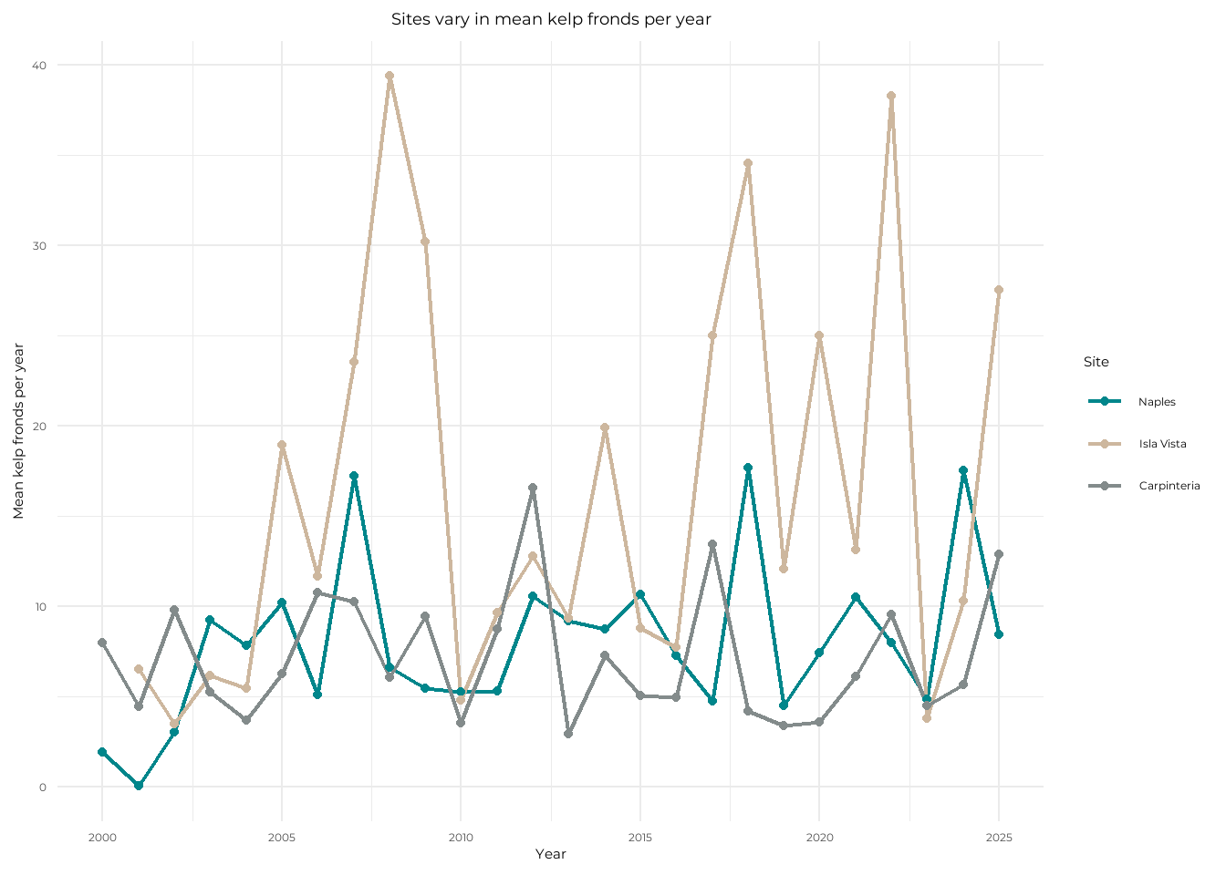
d.
The site with the most variable mean kelp fronds per year is Isla Vista, as it has the highest points compared to its lowest points seen with the longest lines. The site with the least variable mean kelp fronds per year is Carpinteria, as it has the least peaking relative to the rest of its data points with shorter lines and is also the most consistent in the y-axis region that the points stay in.
Problem 3.
a.
The 1s and 0s represent the Mountain Plover nest use, 1 meaning presence of nest use and 0 meaning no nest use.
b.
Visual obstruction is a continuous variable that is metric incorporating both vegetation height and density, which are measured components. As visual obstruction increases the probability of Mountain Plover nest site use would decrease, and this is due to activity of black-tailed prairie dog colonies clipping vegetation to maintain visibility for predators, which makes for ideal nesting habitat for the plover, meaning that if there exists more visual obstruction by vegetation, then it would not be as suitable for the plovers to nest (Introduction, paragraph 3).
Distance to prairie dog colony edge is a continuous variable as it is a measurement value in metric units. As distance to prairie dog colony edge increases, the probability of Mountain Plover nest site use would decrease. This is also for similar reasons of soil disturbance and vegetation consumption by prairie dogs that make their colonies ideal habitats for plovers (Introduction, paragraph 3).
c.
| Model number | Visual obstruction | Distance to prairie dog colony | Model description |
|---|---|---|---|
| 0 | no predictors (null model) | ||
| 1 | X | X | all predictors (saturated model) |
| 2 | X | Visual obstruction | |
| 3 | X | Distance to prairie dog colony |
d.
mopl_clean <- mopl |> # create new clean dataframe for mopl
  clean_names() |> # clean column names to lowercase and underscores
  mutate(used_bin = recode_values(id, # create new column called used_bin to create 1s and 0s from id column
    "used" ~ 1, # when row says "used", use value "1"
    "available" ~ 0)) |> # when row says "available", use value "0"
  select(used_bin, edgedist, vo_nest) # select to display specific columns
# model 0: null model
model0 <- glm(used_bin ~ 1, # GLM with no predictors and only response
data = mopl_clean, # use mopl_clean data
family = "binomial") # binomial error distribution
# model 1: saturated model
model1 <- glm(used_bin ~ vo_nest + edgedist, # GLM with predictors visual obstruction and distance from colony
data = mopl_clean, # use mopl_clean data
family = "binomial") # binomial error distributio
# model 2: visual obstruction
model2 <- glm(used_bin ~ vo_nest, # GLM with predictor visual obstruction
data = mopl_clean, # use mopl_clean data
family = "binomial") # binomial error distributio
# model 3: distance to prairie dog colony
model3 <- glm(used_bin ~ edgedist, # GLM with predictor distance from colony
data = mopl_clean, # use mopl_clean data
family = "binomial") # binomial error distributioe.
AICc( # calculate AIC for each model
  model0,
  model1,
  model2,
  model3) |>
  arrange(AICc) # by decreasing AIC
df AICc
model2 2 331.8130
model1 3 333.8293
model0 1 384.6318
model3 2 386.1351The best model as determined by Akaike’s Information Criterion (AIC) is the one including the response of nest use (with the used_bin column) and visual obstruction as a predictor.
f.
plot(simulateResiduals(model2)) # plot residuals using function from DHARMa for model2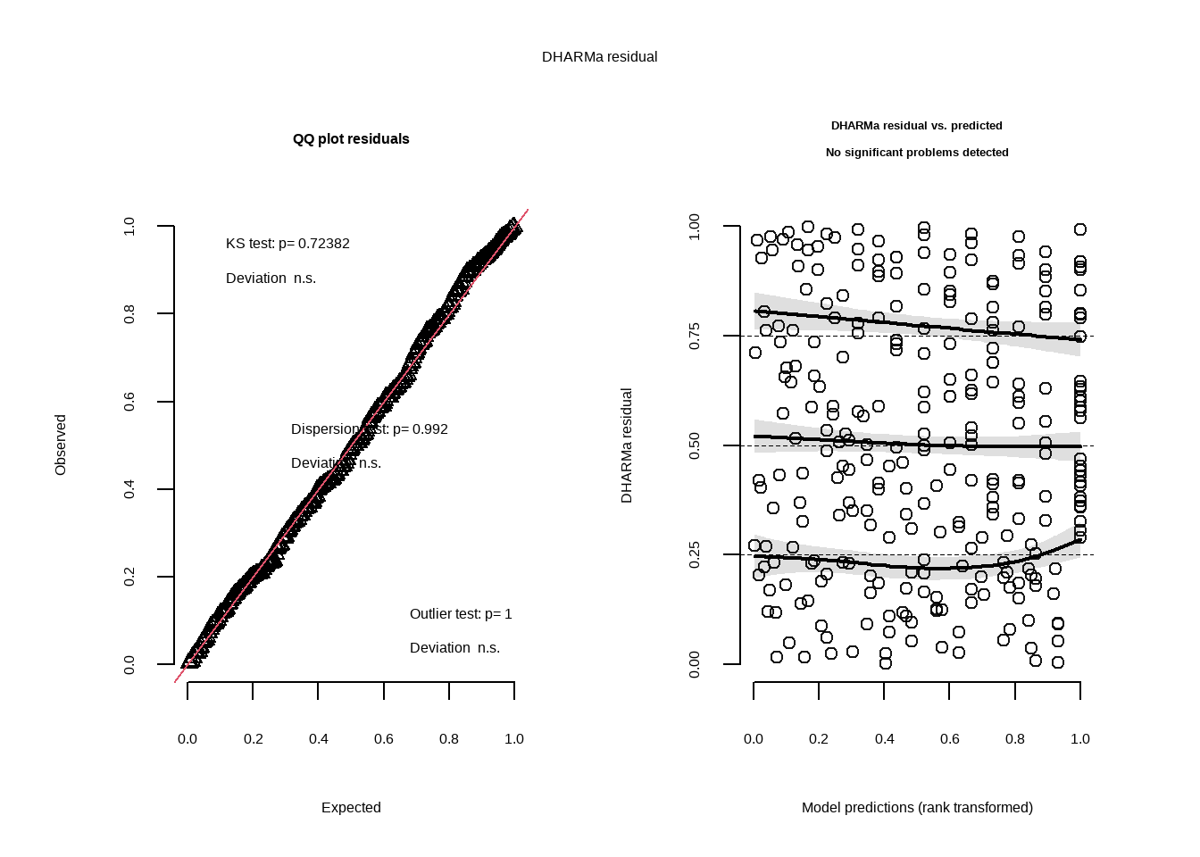
g.
mod_preds <- ggpredict(model2, # create object for model2 predictions
                       terms = "vo_nest [0:19 by = 1]") # generate predictions on specific interval

ggplot(mopl_clean, # create plot base with mopl_clean data
       aes(x = vo_nest, # set x-axis
           y = used_bin)) + # set y-axis
  geom_point(size = 3, # plot observations and change point size
             alpha = 0.4, # change transparency
             color = "maroon4") + # change color
  geom_ribbon(data = mod_preds, # plot prediction 95% CI using mod_preds object
              aes(x = x, # use same x-axix
                  y = predicted, # set y-axis as predicted values
                  ymin = conf.low, # set bottom of region
                  ymax = conf.high), # set top
              alpha = 0.3, # adjust tranparency
              fill = "maroon4") + # change color
  geom_line(data = mod_preds, # plot model prediction as line using mod_preds object
            aes(x = x, # use same x-axis
                y = predicted), # set y-axis as predicted values
            linewidth = 2, # change line width to thicker
            color = "maroon4") + # change color
  theme_classic() + # change theme
  theme(text = element_text(size = 20)) + # set font size
  scale_y_continuous(limits = c(0, 1), # adjust y-axis parameters and breaks to only show 0 and 1
                     breaks = c(0, 1)) +
  labs(x = "Visual obstruction", # label x-axis
       y = "Probability of nest use", # label y-axis
       title = "Predictions of visual obstruction impact on probability of Mountain Plover nest use") # set title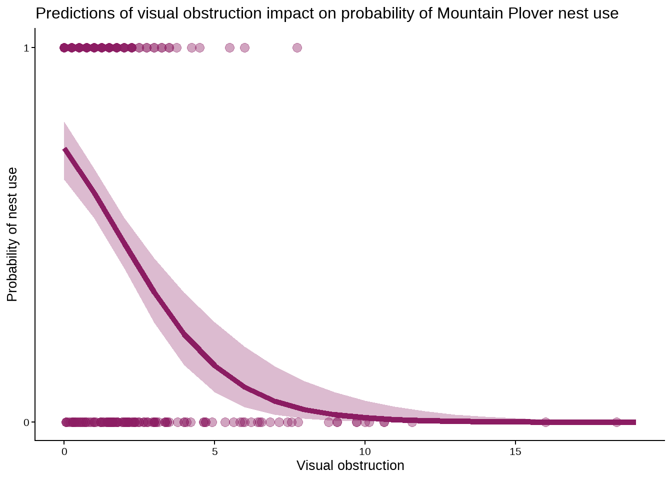
h.
Figure 3. Predictions of visual obstruction impact on probability of Mountain Plover nest use. Points represent observations of visual obstruction at nest and non-nest sites. Shaded region represents 95% confidence interval of model prediction. Line represents model predictions. Data originally from: Duchardt, Courtney; Beck, Jeffrey; Augustine, David (2020). Data from: Mountain Plover habitat selection and nest survival in relation to weather variability and spatial attributes of Black-tailed Prairie Dog disturbance [Dataset]. Dryad. https://doi.org/10.5061/dryad.ttdz08kt7
i.
ggpredict(model2, # make prediction from object model2
          terms = "vo_nest [0]" ) # predict nest probabolity at visual obstruction 0
# Predicted probabilities of used_bin
vo_nest | Predicted | 95% CI
--------------------------------
0 | 0.73 | 0.65, 0.80j.
Nest occupancy by Mountain Plovers is observed more often when the area has less visual obstruction by vegetation. From Figure 3, both observations and model predictions show that as visual obstruction increases, the probability of nest use by Mountain Plovers decreases. This is because shorter, denser layers of vegetation, or taller sparse pieces, that would make up minimal visual obstruction serve the purpose of providing some concealment to plovers while still allowing them to detect ground predators, making for ideal nest habitat. With no visual obstruction (0), the predicted probability of nest site occupancy is 0.73 (95% CI: [0.65, 0.80]). Further, it has been observed directly that vegetation height is higher outside of prairie dog colonies (Duchardt et al. 2019), so there would be more visual obstruction as distance from colonies increases, and thus probability of nest occupancy by plovers would decrease as distance from prairie dog colonies increases.
Problem 4.
a.
The visualizations are different in how I represented my data as the visualization from Homework 2 that involved whether or not I went to class that day was represented as a binomial variable, being “yes” or “no”, and had two x-axis groupings of observations as vertical points, while my affective visualization represented it as a continuous variable, plotting the time i spent in lecture as the predictor with the response of game screen time.
In terms of similarities, none of the plots show any strong trends or relationships between the predictor varaibles and the response of game screen time. It is hard to draw any firm conclusions from the visualizations alone, and further statistical analysis would be necessary.
For my affective visualization, the observations higher on the y-axis are closer to the left, meaning that the largest extreme values of game screen time are when the predictor variable, time spent in lecture, is less. The scatterplot that I did in Homework 2 used a different predictor variable, time spent visiting friends, and though there are much fewer points, the highest observation is on the right side, meaning that the largest extreme of game screen time is when the predictor variable, time at friends’, is greater. From this it could be loosley argued that the time I spent visiting friends’ places has the opposite relationship as time in lecture would on the amount of time I spent on my mobile game. In contrast, the Homework 2 binomial visualization of class to game time showed that when I went to class, my game time was slightly higher, which is not consistent with my affective visualization in representing the relationship between the two variables of class and game screen time.
The feedback I got in week 9 was that I should change my original represented variable of time spent visiting friends to the variable of time spent in lecture. The reason I was suggested this, which is also the reason that I chose to apply the advice, was because my main research question that I proposed was about if me going to class or not influenced the time that I spend with the game open on my phone. I kept the scatter plot and changed the y-axis to be time in lecture when representing the scatter plot points. Another suggestion I got was about incorporating more data predictor variables as differences in shapes or colors of the “fireflies” on my drawing. I also implemented this advice by color coding the points to relate to how many assignments I had due that observation date.
b.
One analysis that I could apply to a research question of “Does having class influence the amount of time I spend on my mobile game?” is Wilcoxon rank-sum test to observe how game time may differ with having class. I am using a non-parametric test because my data likely has outliers that could shift the mean, and also my sample size is not very large. This analysis is appropriate to the question as it would work to compare the days that I did go to class to the days that I didn’t, and see if there is a difference in the distributions of time spent on the game. I would be analyzing class as a binomial predictor variable, being “yes” class or “no” class, and the time with mobile game active as a continuous variable, which would test the null hypothesis that the ranks of game time for “yes” class are the same as the ranks of game time for “no” class.
c.
Check assumptions
Observations from one group are independent from observations from the other –> the observations on class days of game time have no influence on the observations made on non-class days of game time.
Run analysis
wilcox.test(time_with_mobile_game_active_min ~ class, # run non-parametric test to test medians of game time with or without class
            data = personal_data) # use personal data
    Wilcoxon rank sum test with continuity correction

data:  time_with_mobile_game_active_min by class
W = 125, p-value = 0.8127
alternative hypothesis: true location shift is not equal to 0cliffs_delta(time_with_mobile_game_active_min ~ class, # calculate effect size of class on game time
data = personal_data) # use personal datar (rank biserial) | 95% CI
---------------------------------
-0.05 | [-0.43, 0.34]d.
ggplot(data = personal_data, #create plot with personal data
       aes(x = class, # set x-axis
           y = time_with_mobile_game_active_min)) + # set y-axis
  geom_boxplot(aes(fill = class), # plot box plot and fill color by class
               outliers = FALSE, # don't include outlier points
               width = 0.5) + # adjust box plot width
  geom_jitter(width = 0.2, # add underlying observations as points and adjust horizontal jitter
              height = 0, # no vertical jitter
              shape = 21) + # change point shape to hollow circles
  theme_minimal() + # set plot theme
  labs(x = "Class",  # label x-axis
       y = "Time with game active (min)") + # label y-axis
  scale_fill_manual(values = c("no" = "bisque4", # set colors
                               "yes" = "turquoise3")) +
  theme(text = element_text(size = 25)) + # set font size
  theme(legend.position = "none") # remove legend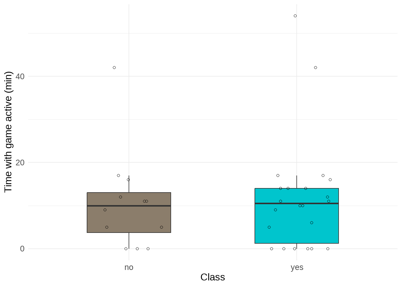
e.
Figure 4. Time with game active (min). Individual points represent observations of tracked game screen time on a day with or without class. Boxes represent interquartile range and the center line of boxes represent median value. Line connected to boxes represents outer quartiles of data.
f.
I found no difference (Cliff’s \(\delta\) = -0.05) in median time with mobile game active between days with class (n = 22) and days without class (n = 12) (Kruskal-Wallis test, W = 125, p = 0.8127, \(\alpha\) = 0.05). The time I spent on my mobile game was minusculey larger on days with class (median = 10.5 min) than days without class (median = 10 min).