library(tidyverse) # general use
library(here) # file organization
library(janitor) # cleaning data frames
library(readxl) # reading excel files
library(ggpattern) # geom pattern customization
library(ggthemes) # extra plot themes
library(showtext) # to show custom text on plot
library(sysfonts) # to read in custom google font
library(GGally) # for more complex plots (correlation heatmap)
library(labelled) # for customizaing variable labels
font_add_google(name = "Bellefair", # Name of the font on the Google Fonts site
                family = "belle") # Name to call the font
showtext_auto() # automatically use showtext to render text

personal_data <- read_csv(here("data",
                               "personal_data_03072026.csv")) # save personal data as object
personal_data_clean <- personal_data |> # create clean data frame of personal data
  clean_names() |> # clean column names to lowercase and underscores
  mutate(Date = as.Date.character(date, format = "%m/%d/%Y"), # mutate date column into readable dates
         Game = time_with_mobile_game_active_min, # creating columns with updated names, new name = old name
         Class = time_in_class_lecture_hrs, #  new name = old name
         Study = time_spent_in_study_spaces_hrs, #  new name = old name
         Friends = time_spent_at_friends_hrs, #  new name = old name
         Assignments = number_of_assignments_due) |> #  new name = old name
select(Date, Game, class, Class, Study, Friends, Assignments) # select columns of interestAdvanced Visualization Code
Set up
Visualization 1.
hexplot <- ggplot(data = personal_data_clean, # create base ggplot layer with clean df
       aes(x = Class, # set x-axis
           y = Game)) + # set y-axis
  geom_hex(bins = 11) + # customize bin number  (to smallest # that won't cut off geom shape near border)
  scale_fill_continuous(type = "gradient", # customize color of hexbins
                        low = "#39240A", # set low count occurence color
                        high = "#A0A0A0") + # set higher count occurence color
  theme_void() + # set theme to remove axis and labels
  theme(legend.position = "none") + # remove legend
  theme(plot.margin = margin(t = 1, # create 1 cm margin around all sides
                             r = 1,
                             l = 1,
                             b = 1,
                             unit = "cm"),
         plot.background = element_rect(fill = "#F5F3EF")) + # set background color
  geom_curve(x = 2.25, # x-axis start point
             y = 50, # y-axis start point
             xend = 1.5, # x-axis end point
             yend = 45, # y-axis end point
             curvature = 0.6, # positive curve of 0.6 magnitude
             angle = 70, # angle where curve happens
             linewidth = 2, # customize width
             arrow = arrow(length = unit(0.5, "cm")), # add arrow to line and sest size
             lineend = "round", # customize end of line
             col = "#B4A073") + # set color
  annotate("text", # add in plot text annotation
           x = 2.53, # x coordinate for text
           y = 46, # y coordinate for text
           label = "Plot area divided into bins", # set text label
           color = "#39240A", # set color
           size = 12, # set size
           family = "belle") # set font

ggsave(filename = here("images", "hexplot.png")) # save as png in images folder

plot(hexplot) # display plot output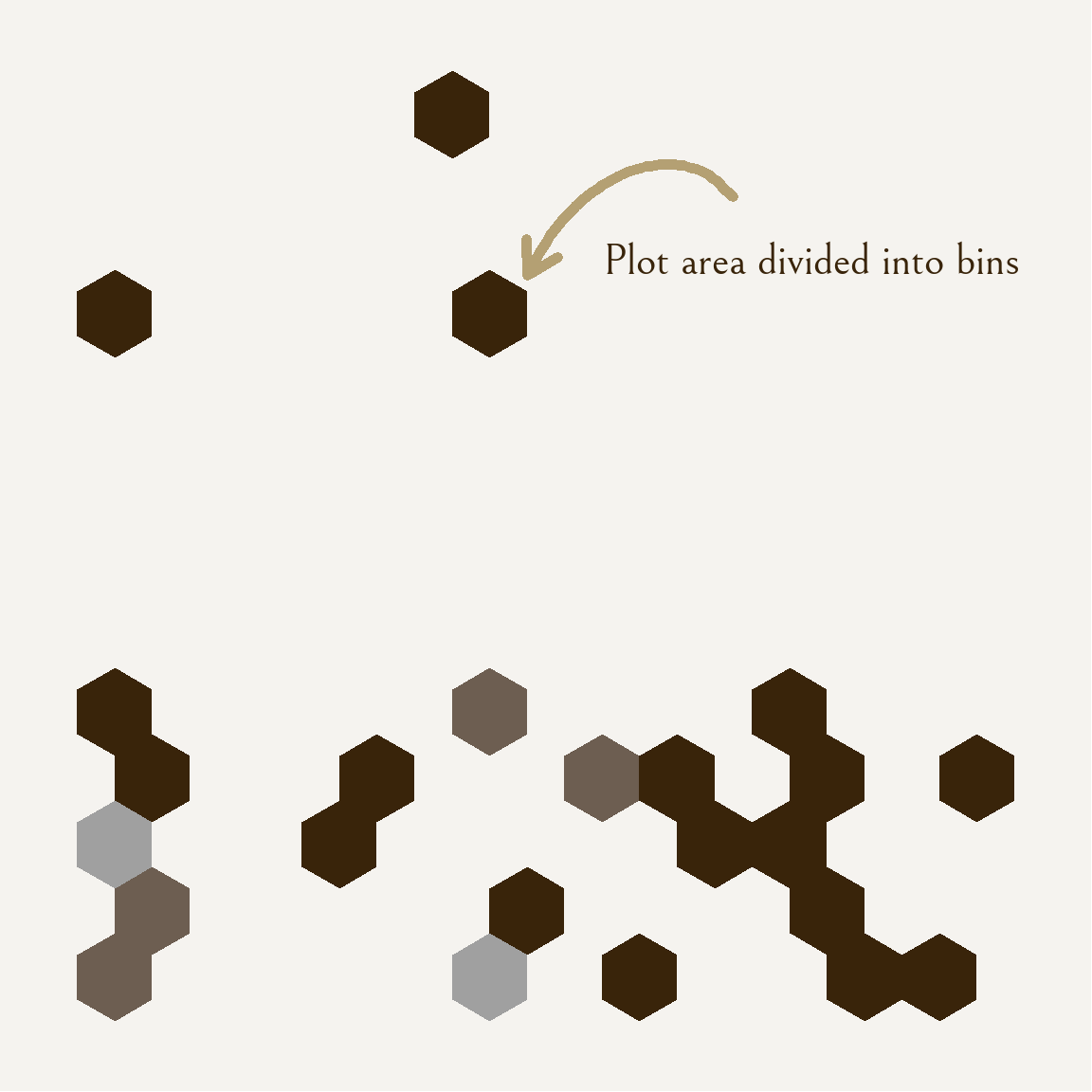
Visualization 2.
corrmatrix <- ggcorr(data = personal_data_clean, # create correlation heatmap with clean df
       method = c("pairwise", "spearman"), # choose method of correlation on data
       low = "#8500E9", # set negative correlation color
       mid = "#C0CDFF", # set close to 0 correlation color
       high = "#56E900") + # set positive correlation color
  theme_minimal(base_family = "belle") + # set theme to minimal and base text font
  theme(text = element_text(size = 30), # set font size
        plot.background = element_rect(fill = "#F5F3EF"), # set background color
        legend.position = "top") # put legend at top

ggsave(filename = here("images", "corrmatrix.png")) # save as png in images folder

plot(corrmatrix) # display plot output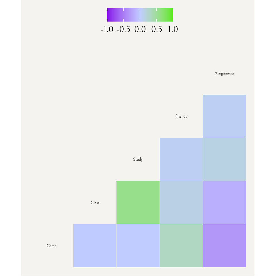
Visualization 3.
coeff <- 18 # define coefficient for later use

timeseries <- ggplot(data = personal_data_clean, # create base ggplot layer with clean df
       aes(x = Date)) + # set x-axis as date to create time series
  geom_line(aes(y = Class), # create line for time in class
            color = "#A0A0A0", # set color
            linewidth = 1) + # set width
  geom_line(aes(y = Game/coeff), # create line for time spent on game and divide values to scale it to existing y-axis values of hours
            color = "#0F0F0F", # set color
            linewidth = 1) + # set width
  scale_y_continuous(name = "Time in lecture (hrs)", # scale first y-axis to hours and name it and name it accordingly
                     sec.axis = sec_axis(~ . * coeff, # scale second y-axis to minutes and name it accordingly
                                         name = "Time tracked on game (min)")) +
  theme_classic() + # set theme to classic
  theme(text = element_text(family = "belle"), # set base font
        plot.background = element_rect(fill = "#F5F3EF"), # set entire background color
        panel.background = element_rect(fill = "#F5F3EF"), # set plot background color
        panel.border = element_rect(fill = NA, # create border, set color and width
                                    color = "#B4A073",
                                    linewidth = 5),
        axis.title.x = element_text(size = 40, # set size and color of bottom axis
                                    color = "#39240A"),
        axis.title.y.left = element_text(size = 35, # set size and color of left axis
                                         color = "#A0A0A0"),
        axis.title.y.right = element_text(size = 35, # set size and color of right axis
                                          color = "#0F0F0F"),
        axis.text.x = element_text(size = 30, # set size and color of x-axis ticks text
                                   color = "#39240A"),
        axis.text.y = element_text(size = 35, # set size and color of y-axis ticks text
                                   color = "#39240A"),
        axis.line = element_blank() # remove axis lines
       )

ggsave(filename = here("images", "timeseries.png")) # save as png in images folder

plot(timeseries) # display plot output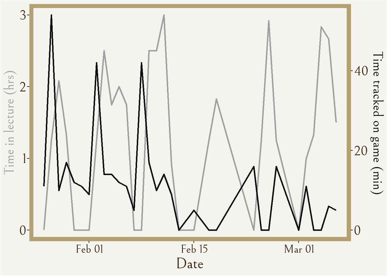
Infographic planning brainstorm notes
Fonts - Brothers, Sabbath Black, Bellefair
Colors - logo: ~gold “C6A06E” , white “FFFFFF” ;
Box border: ~wheat”B4A073” Box interior: ~cream “F5F3EF”
Stripe dark “C2B28E” Stripe light “CDC0A2” Perimeter ~black “0F0F0F”
Symbol accents: ~wheat” B4A073” ~black “0F0F0F” ~cream “F5F3EF” ~grey “A0A0A0
Font ~brown “39240A”
Shiny button ~Dgrey “333333” ~black “0F0F0F”
Write-up
General Information about design and visualization
Visualization 1 is a hexbin density plot that highlights the amount of time I spend in lecture on the x-axis to the amount of tracked time with the game on the y-axis. Lighter colors represent a higher count of observations in the bin for that area of the plot, and the highest count is 3, represented by the lightest grey color. I wanted to have some sort of “scatter” chart that had different colored points across the plot area, and I came across this visualization type on Yan Holtz’s “From Data to Viz” website. Although, due to the lack of observation points, the density plot did not turn out quite the same as what was advertised, but I still enjoy the look of it.
Visualization 2 is a correlation matrix that visually represents the correlation between all continuous variables that I measured, including (from left to right) the time spent on the game, in class, in study spaces, and at friends, as well as the number of assignments due for the day. I found this correlogram visualization also on Yan Holtz’s “From Data to Viz” website and thought it would be interesting to see how each variable may relate to the time I spent on the game with correlation, but also how each variable may relate among each other.
Visualization 3 is a time series of two variables, time tracked on the game and time spent in lecture, which I of course found from Yan Holtz’s website, but this time the “R Graph Gallery”. I chose to once again visualize the same “game” and “class” variables as in visualization 1, except this time with the function of time playing a role in the visual story. As I was collecting my data, I knew with passing weeks that I was opening my mobile game on my phone less and less often and for shorter periods of time. Further, I know that school workload is directly to blame, not only because it was something I actively thought about, but also because this is highlighted in visualization 2 with moderate negative correlation represented between number of assignments due and game time. So, I wanted to express the data with the “date” column of my data.
Practically all aesthetic choices like color, font, background, etc. stem directly from aesthetics in the mobile game that my data is about, mostly from “Menu” aesthetics of the game. This choice creates a more meaningful narrative of the visualization as it directly ties to the data and captures the same feelings that the game would emit in style and presentation.
Sources and process
For my first visualization of a 2D density plot using hexbins, I was inspired by the simplicity of Nicola Rennie’s Simpsons word counts that was followed with a descriptive explanation that gave good context on the visualization, and I wanted to do something similar of creating something visually interesting that requires context to understand. All three visualizations take inspiration from Victor Gauto’s D&D visualization containing custom font that strongly relates to the theme of the data content itself, which I decided to use a font that closely resembles a font in the mobile game. I also was inspired to do a time series plot by Georgio Karamanis’s Himalayan expedition data that was represented across time.
When setting up my data, I had originally been only using the original data frame that I created for my personal data, but at some point I decided to clean the data with a new frame where I also only selected the variables I was planning on using. Even within this cleaning of data I made many changes over time as to how I was cleaning it and re-naming the columns and such, and this was because (after much trial and error) I was unable to figure out how to customize the variable labels for my correlation matrix and had to set the column names to one-word descriptions. My set up library also changed a lot as I figured out which visualizations I wanted to keep and which of the packages I installed and opened I would actually need. Some geoms I had tried out but decided against were geom_area for an attempted area and stacked area plot with gradient color, geom_point for a classic scatterplot, and geom_density for a gradient smear of colors. I decided on the geom visualizations that I currently have selected because I like the clean look as some of the other ones looked too messy or unpleasant. I had a lot of trial and error with importing the font and then actually applying it to each of the visualizations, and again with exporting the visualizations as .PNGs with code and putting it into the appropriate folder. I would say most of my time coding was researching + trialing how to customize the plots in different ways and the specific wording of functions for things to actually work.
The tools I used were “Help” in RStudio, visualization codes on Yan Holtz’s websites, and google with websites like “Statology”, “R CODER”, “GeeksforGeeks”, and blog websites specialized for code or similar topics.